no. 2| 04.27.2014 |
Wireframe exercise.
A follow up to post no. 1, here are the results of the “reverse engineering” exercise to generate wireframes for the 3 sites I reviewed.
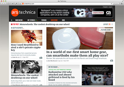
ArsTechnica
What problem is the web page solving?
What visual challenges are there?
The ArsTechnica homepage’s main challenge is managing density: there’s a ton of info crammed onto this single page. It could easily be overwhelming. The homepage has to give an overview of articles from several content categories, provide site navigation, reveal (or at least hint at) site features and services for users, provide global functions like login and search, make space for advertising — even cross promote other sites owned by the publishing company. That’s a lot. If not handled well, a single page with that much information can seem like an overwhelming wall of data that leaves a user without a clear path of action.
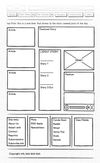
Click here for the fullsize wireframe.
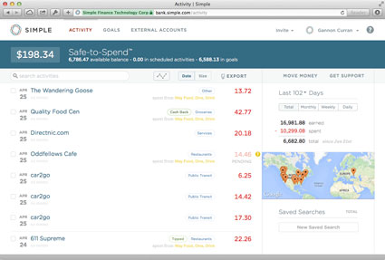
Simple
What problem is the web page solving?
What visual challenges are there?
When a user logs into their account, the web app needs to be immediately useful. Lots of bank sites make you go through a few steps to see your transaction detail. That needs to be streamlined. Simple's answer is to make the transaction history the user "homepage". The resulting visual challenge is how to present lots of data in a clear way. They use a lot of inline feedback to guide users, and carefuly separate top level transaction info from more specific details to keep the clutter down. Specific details are presented dynamically and contextually in a sidebar pane.
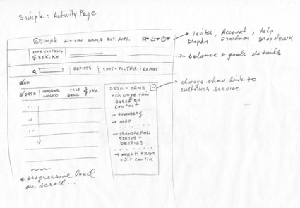
Click here for the fullsize wireframe.
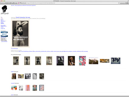
Ffffound
What problem is the web page solving?
What visual challenges are there?
The problem this page appears to tackle is how to present details about an image. This is one level down from the homepage, which is just a "stream" of images, but this detail page doesn't really give much additional info about the image. In reality, the problem this page really tackles is how to provide a dead simple way for site visitors to explore the image collections of other users that have similar interests and tastes. I see two visual challenges here: the first being that this is a site about images, so having a bunch of overdone design and navigation that competes with content would be a negative — the second is allowing navigation along what are essentially curated "paths" without banging the user over the head about it, and keeping an element of randomness at the same time.
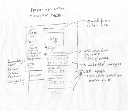
Click here for the fullsize wireframe.